How to Create a Successful Landing Page in 10 Steps
Creating a successful landing page is not just about designing a beautiful page, adding a catchy headline and placing a button somewhere above the fold. A landing page works when it turns attention into action: a lead request, a purchase, a booked call, a newsletter subscription, a download, a demo request or any other conversion that matters for your business.
The problem is that many companies invest serious money in Google Ads, Meta Ads, LinkedIn Ads, email marketing, SEO or social campaigns, but then send that traffic to weak, generic or confusing pages. The campaign may be well targeted. The audience may be relevant. The offer may even be interesting. But if the landing page does not persuade, reassure and guide the visitor, conversions will suffer.
In many cases, the issue is not the traffic. It is the page where that traffic lands.
A strong landing page must be clear, fast, relevant, persuasive and focused on one main action. It should not try to explain everything about your company. It should help a specific visitor understand a specific offer and make a specific decision.
In this guide, we will see how to create a successful landing page in 10 steps, with practical advice you can use to improve conversions, reduce wasted ad spend and build a more effective digital marketing funnel.
What is a landing page?
A landing page is a web page designed to receive traffic from a specific source and encourage visitors to complete a specific action. That traffic may come from an advertising campaign, a social media post, an email campaign, a search engine result, a webinar invitation or a lead generation activity.
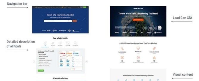
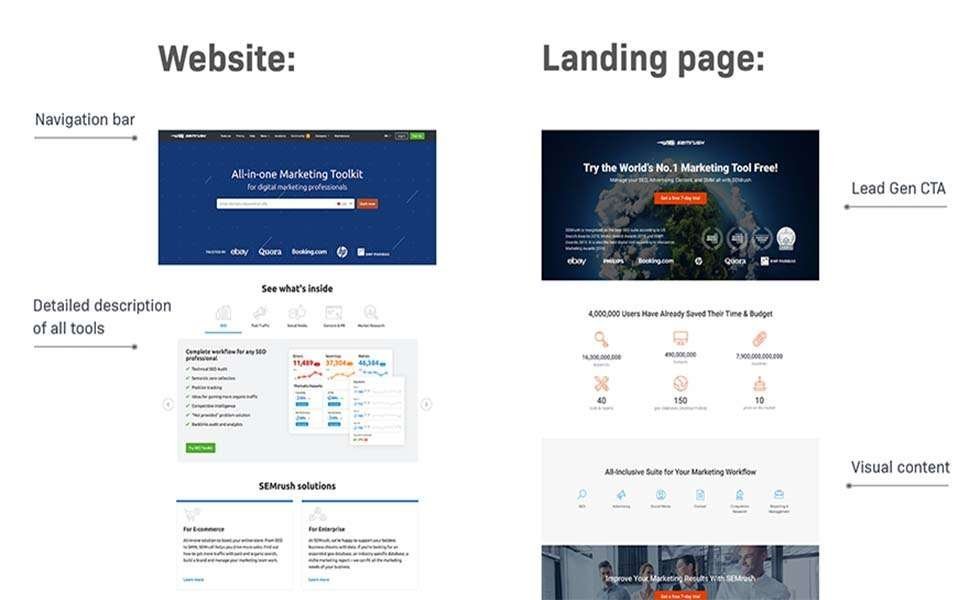
Unlike a standard website page, a landing page usually has a narrower goal. A homepage introduces the company and often gives users many possible paths. A landing page, instead, is built around one main conversion.
Examples of landing page conversions include:
- requesting a quote;
- booking a consultation;
- submitting a contact form;
- downloading an ebook or checklist;
- signing up for a newsletter;
- buying a product;
- registering for a webinar;
- starting a free trial;
- requesting a product demo.
In other words, a landing page is not just a design asset. It is a commercial tool. It sits at the point where traffic, messaging, user experience, copywriting, trust and data meet.
Why landing pages matter so much
A landing page is often the difference between a campaign that generates business and a campaign that only generates clicks.
You can have a well-structured advertising account, strong targeting, good creatives and a relevant audience. But if the page fails to explain the offer, build trust or make the next step obvious, users leave. And when users leave, your cost per lead rises.
A well-designed landing page can help you:
- increase conversion rate;
- reduce cost per lead or cost per acquisition;
- improve the quality of generated leads;
- make campaigns more coherent;
- strengthen trust before the sales conversation;
- understand which messages and offers work best;
- turn paid and organic traffic into measurable business opportunities.
This is why landing page optimization should not be treated as a minor design task. It is part of your broader web marketing strategy. If the page does not convert, the entire acquisition system becomes weaker.
How to create a successful landing page in 10 steps
Let’s go through the 10 most important steps to create, review or improve a landing page that can actually generate results.
1. Start with one clear goal
The first rule of every effective landing page is simple: one page, one main goal.
If you want users to request a quote, the entire page should guide them toward that request. If you want them to download a guide, the page should build the value of that download. If you want them to book a call, every section should help them understand why that call is worth their time.
Many landing pages fail because they try to do too many things at once. They ask visitors to read the blog, follow the company on social media, visit the homepage, discover all services, download a resource, contact sales and maybe subscribe to a newsletter too.
That is too much.
A landing page should not feel like a busy crossroads. It should feel like a guided path.
Before writing or designing anything, answer these questions:
- What is the main action I want the visitor to take?
- Who is the visitor?
- Where is the traffic coming from?
- What promise did the visitor see before clicking?
- What problem does this page need to solve?
- What doubts could stop the visitor from converting?
When the goal is clear, it becomes much easier to decide what belongs on the page and what should be removed.
2. Make the promise obvious immediately
In the first few seconds, visitors should understand where they are, what you are offering and why they should continue reading.
The headline is not the place for vague creativity. It is the place for clarity.
A strong hero section usually includes:
- a clear headline;
- a short supporting subtitle;
- a visible call to action;
- a trust element;
- a relevant image, video or visual asset.
For example, this headline is weak:
Innovative solutions for your business
It sounds nice, but it says almost nothing.
This version is stronger:
Turn paid traffic into qualified leads with a landing page designed for conversion
The second version is more specific. It tells the visitor what the page is about, what outcome matters and why the offer may be relevant.
Clarity usually beats cleverness. A landing page should not make users work hard to understand what you do.
3. Match the message with the traffic source
A landing page does not exist in isolation. It is part of a journey.
If a user clicks an ad promising a “free consultation to improve ecommerce conversions”, the landing page should not open with a generic paragraph about the history of your company. It should continue the same conversation started by the ad.
This is often called message match: the message in the ad, email, social post or search result should match the message on the landing page.
When message match is weak, visitors feel a disconnect. They clicked for one reason but landed on something that feels different. Even if the offer is good, trust drops.
To improve message match, check these elements:
- Does the headline reflect the promise made before the click?
- Is the offer immediately recognizable?
- Is the page written for the same audience?
- Is the call to action aligned with the visitor’s intent?
- Does the page continue the same topic, tone and expectation?
This is especially important when running paid campaigns. A landing page connected to Google Ads should be extremely consistent with the search intent. A landing page connected to social campaigns may need more context, because the visitor may be less problem-aware.
The landing page must respect the visitor’s level of awareness. Asking for too much too early can reduce conversions. Asking for too little can generate weak leads.
4. Keep the offer at the center of the page
A successful landing page should not talk about everything. It should talk about the offer.
This applies to products, services, software, consulting, events, lead magnets and demos. Every section should help visitors understand what they will receive, why it matters and why they should trust you.
Avoid filling the page with secondary information that does not support the conversion. The full company history, all your services, press releases and general updates may be useful somewhere else, but they usually do not belong at the center of a landing page.
Your product, service or offer should be the protagonist.
To make the offer clear, explain:
- what is included;
- who it is for;
- what problem it solves;
- what outcome it helps achieve;
- how it works;
- what makes it different;
- what happens after the visitor converts.
One common mistake is thinking that “less copy” always means “more conversions”. That is not true. The right length depends on the offer.
If the offer is simple and low-risk, a short landing page may be enough. If the offer is complex, expensive or trust-based, visitors usually need more information, more proof and more answers before taking action.
5. Show what you are offering
Online, users cannot touch the product, meet you in person or immediately verify your claims. This is why your landing page should make the offer as concrete as possible.
Images, screenshots, videos, demos, previews, mockups and examples reduce uncertainty.
If you sell a physical product, show:
- real product photos;
- close-up details;
- size and proportions;
- the product in use;
- available variations;
- short demonstration videos.
If you sell a service, show:
- your process;
- examples of deliverables;
- before-and-after comparisons;
- case studies;
- client outcomes;
- testimonials.
If you sell software, show:
- interface screenshots;
- short product videos;
- key features;
- use cases;
- integrations;
- the practical result for the user.
The more concrete the offer becomes, the easier it is for visitors to understand it. And what people understand more clearly, they evaluate more confidently.
6. Demonstrate instead of just promising
A weak landing page says: “We are the best.”
A strong landing page shows why the visitor should believe you.
This difference matters. Users are exposed every day to pages full of phrases like “high quality service”, “tailor-made solutions”, “professional support” and “measurable results”. The problem is that these claims, by themselves, do not prove anything.
To increase credibility, use real proof:
- measurable results;
- verified testimonials;
- client logos, when authorized;
- short case studies;
- certifications;
- product demos;
- guarantees;
- transparent process explanations;
- frequently asked questions.
Instead of writing:
We help companies improve online performance.
You could write:
We analyze traffic, campaigns and conversion pages to identify where leads are lost and which changes can improve acquisition costs.
The second sentence is not louder. It is clearer. And clarity is often more persuasive than hype.
7. Use a clear and repeated call to action
The call to action, or CTA, is the point where you ask the visitor to take the next step.
A good CTA should be visible, specific and consistent with the offer. Visitors should know exactly what will happen after they click.
Generic buttons such as “Submit”, “Click here” or “Learn more” can work in some contexts, but they are often weak. More specific CTAs usually perform better because they reduce ambiguity.
Examples of stronger CTAs include:
- Request a consultation;
- Book a free call;
- Download the guide;
- Get your quote;
- Start your free trial;
- Analyze your landing page;
- Request a demo.
The CTA should not appear only once. On a medium or long landing page, repeat it at strategic points: after the hero section, after the main benefits, after proof elements and near the end of the page.
But repetition does not mean confusion. You can repeat the same action several times, but the main conversion goal should remain the same.
A simple test: if visitors scroll quickly, can they still understand what they are supposed to do?
8. Increase the perceived value of the offer
People do not evaluate offers only by price. They evaluate them by perceived value.
Two offers with the same price can feel completely different depending on how they are presented. One may feel expensive. The other may feel like a smart investment. The price did not change. The perception did.
To increase perceived value, you can:
- explain exactly what is included;
- show the final result;
- compare the cost with the potential benefit;
- add genuinely useful bonuses;
- reduce risk with guarantees or trials;
- show the time saved;
- explain the cost of inaction;
- make the process feel simple and safe.
A strong offer does not always require a discount. It can be a free audit, a checklist, a consultation, a personalized analysis, a trial, faster delivery, included support or a more complete package.
The key is credibility. Fake urgency, invented countdowns and exaggerated promises can hurt trust. A good landing page makes the offer attractive without making it look suspicious.
9. Answer objections before the form
Every visitor arrives with doubts. Some are obvious. Others are silent. The problem is that most visitors will not tell you what stopped them. They will simply leave.
Common objections include:
- How much does it cost?
- Is this right for my situation?
- How long does it take?
- Can I trust this company?
- What happens after I fill out the form?
- Will someone call me immediately?
- Will I receive spam?
- Is this really different from other options?
- Do I have enough information to decide?
A strong landing page anticipates these questions and answers them naturally. You can use FAQ sections, short notes near the form, testimonials, comparison blocks, guarantees, microcopy or process explanations.
For example, near a form you could write:
We will contact you only to better understand your request. No automatic newsletter subscription and no aggressive sales calls.
This small detail can reduce friction, especially in B2B contexts where people often hesitate before submitting a form.
Objections are not a problem. They are useful material for improving the page.
10. Measure, test and improve continuously
A landing page should never be considered finished forever. Even a good page can improve when you look at real data.
The most important landing page metrics include:
- conversion rate;
- cost per lead;
- cost per acquisition;
- time on page;
- scroll depth;
- CTA clicks;
- form abandonment;
- lead quality;
- mobile performance;
- page speed;
- results by traffic source.
Do not look only at how many people fill out the form. Look at lead quality too. A landing page may generate many contacts, but if they are not relevant, the commercial problem is not solved.
You can test many elements:
- the main headline;
- the CTA text;
- the order of sections;
- the length of the form;
- the visual asset;
- the offer;
- the testimonials;
- the FAQ section;
- the mobile layout;
- the first screen above the fold.
Optimization should not be based only on personal taste. A sentence that sounds good to the internal team is not always the sentence that converts best. Data helps separate opinions from real user behavior.
Essential elements of a high-converting landing page
Every landing page is different, but most effective pages include a few recurring elements. These are not rigid rules, but they provide a useful structure.
A benefit-driven headline
The headline should explain the value of the page immediately. It should tell visitors they are in the right place.
A supporting subtitle
The subtitle expands the promise and clarifies who the offer is for and what outcome it can help achieve.
A visible call to action
The main CTA should be easy to find and should clearly describe the next step.
A relevant visual
Images, videos or screenshots should support the message. They should not be used only as decoration.
Clear benefits
Visitors should quickly understand why the offer matters. Benefits should be connected to real problems, not generic marketing language.
Trust elements
Testimonials, reviews, case studies, numbers, certifications and guarantees help make the promise more credible.
A simple form
The form should ask only for the information needed at that stage of the journey. Every additional field can increase friction.
FAQ and objection handling
Frequently asked questions help remove doubts that may otherwise stop visitors from converting.
A strong mobile experience
The landing page should be easy to read, navigate and complete on a smartphone. Mobile users should not have to zoom, fight with forms or search for the CTA.
Common landing page mistakes to avoid
Many landing pages fail because of simple but costly mistakes.
The most common include:
- a generic headline;
- an unclear promise;
- too many goals on the same page;
- a weak or hidden CTA;
- a form that is too long;
- lack of trust signals;
- too much company-focused copy;
- decorative images that do not explain anything;
- slow loading speed;
- poor mobile experience;
- weak message match with ads or emails;
- unclear offer;
- no answer to objections;
- missing conversion tracking.
Another common mistake is talking too much about the company and too little about the visitor. People do not land on a page to admire your internal structure. They want to understand whether you can help them solve a problem.
The key question is always: does this section help the visitor understand, trust or act?
Landing pages and SEO: should you optimize them for Google?
It depends on the purpose of the page.
If a landing page is built only for a temporary advertising campaign, conversion may be the main focus. But if the page targets a topic people search for, SEO should be part of the strategy.
An SEO-friendly landing page should include:
- a clear title aligned with the main keyword;
- content that satisfies search intent;
- well-structured headings;
- useful explanations, not only promotional copy;
- FAQ sections;
- internal links to related resources;
- optimized images;
- good technical performance;
- a structure that is easy for search engines and AI systems to interpret.
This does not mean every landing page must become a very long article. It means the page should answer the visitor’s intent while still guiding them toward conversion.
SEO brings traffic. The landing page must turn that traffic into business opportunities. This is also why landing pages should be integrated into a broader marketing strategy, rather than treated as isolated assets.
Landing pages and AI: how to make your page easier to understand
Today, a landing page should be clear not only for users and search engines, but also for AI systems that read, summarize and interpret content.
To make a landing page more AI-friendly, focus on clarity and structure:
- define the topic early;
- answer key questions directly;
- use descriptive headings;
- keep sections logically organized;
- include real examples;
- avoid vague promotional language;
- use consistent terminology;
- add FAQ blocks;
- link to relevant related content.
An AI-friendly landing page is not a page written for machines. It is a page written better: more explicit, more useful and easier to interpret.
Generative search systems tend to rely on content that can be understood, summarized and connected to a specific intent. A landing page with clear sections, concrete answers and strong context is more likely to be useful both for humans and for AI-powered discovery.
Landing page checklist
Before publishing or updating a landing page, use this checklist:
- Is the promise clear in the first few seconds?
- Does the page have one main goal?
- Is the CTA visible and specific?
- Does the page match the message from the traffic source?
- Are benefits more visible than generic features?
- Is there enough proof to support the promise?
- Does the form ask only for necessary information?
- Are the main objections answered?
- Does the page work well on mobile?
- Is the page fast enough?
- Are conversions tracked correctly?
- Is the page improved based on real data?
If several answers are negative, you already know where to start improving.
Landing pages inside the marketing funnel
A landing page is not just a page. It is one step in a larger acquisition system.
For example, a user may first discover your brand through an article, a LinkedIn post, a social media campaign or an offline interaction. Then the user may visit a landing page, download a resource, receive follow-up emails and eventually speak with sales.
This is why landing pages should be connected to the broader funnel:
- traffic generation;
- lead capture;
- lead qualification;
- email follow-up;
- sales conversation;
- remarketing;
- customer nurturing.
If the page generates leads but there is no follow-up, opportunities are lost. If the page attracts the wrong users, sales will waste time. If the page is not aligned with the offer, conversion rates will remain low.
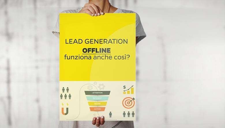
This is true for online campaigns, but also for traditional channels. Even offline lead generation can become more effective when it is connected to strong digital touchpoints. I explored this topic in more detail in this article on offline lead generation.
FAQ about landing pages
How long should a landing page be?
A landing page should be as long as necessary to persuade the visitor to take the desired action. Simple, low-risk offers may require short pages. Complex, expensive or B2B offers often need more explanation, more proof and more objection handling.
Is a short landing page better than a long one?
Not always. A short landing page can work well when the offer is simple and the visitor already understands the value. A longer page may work better when the visitor needs more context, trust and information before converting.
How many calls to action should a landing page have?
A landing page can repeat the same CTA several times, especially if the page is long. However, it should usually focus on one main action. Multiple different CTAs can confuse visitors and reduce conversions.
What is the difference between a homepage and a landing page?
A homepage introduces the company and gives users different navigation options. A landing page is designed around a specific offer and a specific conversion goal.
Do landing pages work only for paid advertising?
No. Landing pages can be used for SEO, email marketing, webinars, product launches, lead magnets, events, social media campaigns, B2B outreach and marketing automation. Whenever you want to turn traffic into action, a landing page can be useful.
What is the biggest landing page mistake?
The biggest mistake is making the value unclear. If the visitor does not immediately understand what the offer is, why it matters and what to do next, the page will lose conversions even if the traffic is relevant.
Can social media traffic convert on landing pages?
Yes, but social traffic often needs more context than search traffic. A user coming from social media may not be actively looking for your solution, so the landing page should educate, build interest and make the next step feel easy. For a broader view, you can read this guide on social media marketing strategies.
Conclusion: successful landing pages are designed, not improvised
Creating a successful landing page means designing a focused path from attention to action.
Design matters, but design alone is not enough. Copy matters, but copy alone is not enough. Speed, trust, visuals, proof, CTA, data and user experience all play a role. The best landing pages bring these elements together around one clear goal.
The most important rule is this: do not build the page only around what you want to say. Build it around what the visitor needs to understand, believe and do.
When a landing page answers the right questions, removes friction, communicates value and guides users toward a clear call to action, conversions stop being a matter of luck. They become the result of a system.
If you want to improve your digital acquisition process more broadly, you may also find these related guides useful: Web Marketing Strategies You Must Not Ignore and Marketing strategies: complete guide to growing your business.

